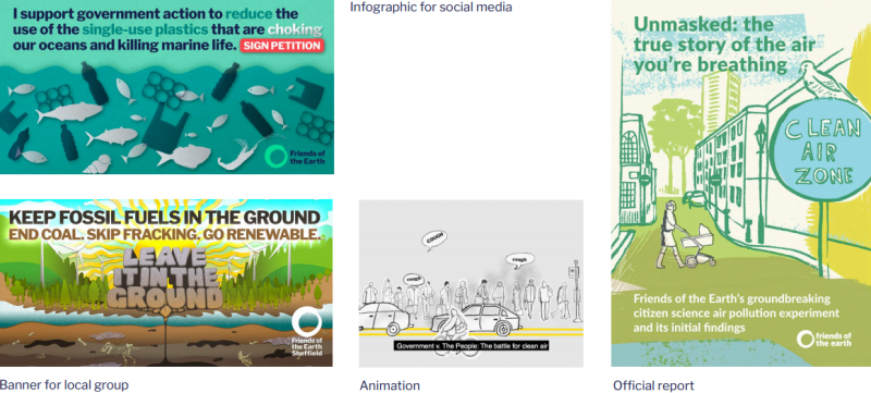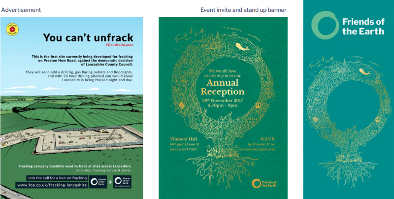
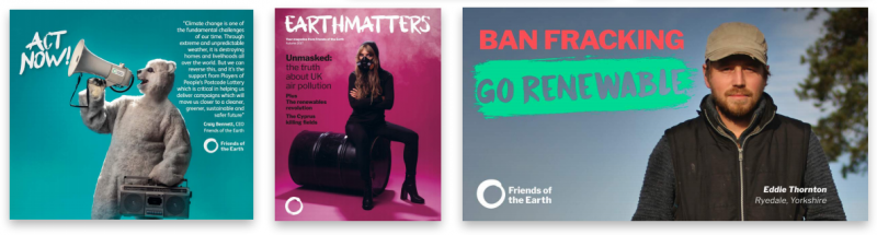
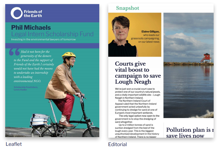
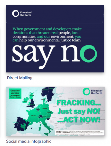
We want all our activities to be recognised as from Friends of the Earth, so more people know who we are and how they can get involved.
So the friends of the earth name and logo takes precedence above campaign, project or event names.
This means we don’t create sub-brands or logos for our campaigns or products. Instead we can reference our campaign or product name within titles or body copy.

Example product - Don't use sub brands or logos
Tone of voice isn’t what we say, it’s how we say it.
It’s not something we just decided would sound good – our voice comes from our history, the way we work, the people we work with, and solutions we put forward. It’s a distinctive expression of our values and personality – Friends of the Earth in its own words.
On a practical level, our voice pulls together everything we say. It makes our story feel consistent, whether it’s part of our website, in emails to supporters, on social media to followers, or anywhere else. And that makes what we say even more memorable and trusted.
In the past, we’ve been seen as sounding caring but boring, well-intentioned but preachy, middle-class but vaguely hippy. That doesn’t do justice either to what we’ve accomplished in the past, or what we’re doing today.
So we need to change the way we tell our story. Here’s how we want to sound to do that.
We’re going places.
We sound visionary, driven, and inspiring.
We’re on it.
We sound down-to-earth, clear, and experienced.
We’ve got this.
We sound optimistic, confident, and celebratory.
We’re in your corner.
We sound empathetic, understanding, and warm.
We’ve always been up for a challenge – and we can show that strength of character in the way we speak.
Our passion and drive inspires our supporters, just as their commitment and dedication inspires us.
That energy is reflected in an active voice; simple, direct statements; unambiguous language; rallying headlines; by asking challenging questions. A bold tone helps us underline our history as a successful organisation, and rallies supporters around us – inspiring them to be equally sincere and fearless in their own actions.
We talk to people clearly and directly, without hyperbole, doomsaying, or vague and ambiguous language.
People are busy and time is often of the essence, so we outline clear, practical solutions that are reassuring and inspiring, using definitive statements, facts, and figures to bring our plans to life.
Our practical voice gives us credibility and is the foundation of our supporters’ confidence and enthusiasm, making urgent appeals feel as though they’re within our reach.
We share achievements with our supporters. We tell the truth to people but we also offer hope.
Together, we have accomplished more than any other environmental organisation, and we know our campaigns can make a difference. We have a lot to be positive about!
So when we speak we know what we can do – we don’t “hope for the best”. We have the knowledge, expertise, and experience that makes us confident and upbeat about the future, and we’re happy to share and celebrate what we’ve accomplished with the world.
People are at the heart of everything we do, so it’s important we sound human. Understand what’s going to trigger an emotional response and use human centred stories. That means using everyday, easily understandable language, and talking to readers as the friends we are – trusted and relatable.
As a rule, when reading copy it should feel as though you’re speaking to one person, rather than an anonymous group. Think global, talk local.
Friends of the Earth is here for everyone, so while some of our supporters are seasoned campaigners, many are not. The people we’re talking to are concerned about many things – for some that means climate change, but for others, it means recycling at school or making sure a local beach is kept clean.
Genuine, human conversations grow support. It’s that simple.
Whether you want to sign a petition, write to our politicians, join in a live debate or march on Westminster, you can make a difference. Take a look to see all the ways you can help with our current campaigns:
If you do one thing… sign our petition today
We’re all time poor, and choice can be overwhelming. Sometimes the most practical solution is the simplest – so offering supporters an easy way to get involved can be more effective.
Environmental Justice
Our environmental justice campaigns need lots of people to take lots of different actions to succeed.
Environmental Justice – a fairer world starts here
Environmental Justice isn’t the easiest concept to understand – but it’s one of the most important aspects of the work we do. You can learn more about it here – and discover the steps you can take to help us create a fairer world for everyone.
The natural world has experienced unprecedented disruption in recent years. And it’s people, as well as the environment, that suffer as a result.
For over 45 years, we’ve been dedicated to the protection of the natural world and the wellbeing of everyone in it. Our international community brings together more than two million people in 75 countries, combining people power all over the world to make an even greater difference and transforming local actions into global impact.
We lead campaigns, provide resources and information, and promote alternative solutions to create a cleaner, healthier, fairer world for everyone, for today and for generations to come.
Working together with local groups, experts, business leaders and politicians, we push for change around the issues and causes that matter to you – protecting your home and local environment, promoting safe and healthy food and water across the globe, and supporting alternative energy solutions that can change the world for the better. Whether you’re a first time supporter or a seasoned campaigner, we’re with you every step of the way.
Together, with us, your voice is louder, your actions more significant, your impact greater. Together, with you, we are determined to change the world for good, for everyone.
Friends of the Earth is an international community dedicated to the protection of the natural world and the wellbeing of everyone in it.
We lead campaigns, provide resources and information, and promote alternative solutions to create a cleaner, healthier, fairer world for everyone, for today and generations to come.
In the UK, we’ve been responsible for making recycling not just a household word, but a household habit. We successfully campaigned for the world’s first climate change laws, which paved the way for similar legislation around the world. Our combined strength has meant we have been able to push back against drilling for fossil fuels in land that belongs to all of us.
Combining the efforts of communities all over the world enables us to make an even greater difference together, meaning local initiatives are transformed into global impact.
Friends of the Earth is an international community dedicated to the protection of the natural world and the wellbeing of everyone in it.
We bring together more than two million people in 75 countries, combining people power all over the world to transform local actions into global impact.
The circle is at the centre of our identity. A circle traditionally symbolises everything from the Earth and the Sun to themes of connection, family and the life cycle. Our circle is synonymous with community.
The circle can be replicated in various styles and appropriated for different uses. This helps our brand grow to something bigger than us.
The circle combines with our name to form our logo. Our logo pays tribute to our heritage while refreshing both type and colour for a contemporary audience.
When space permits, we can break apart our logo, combining the circle with our name in unexpected ways.
Regional & local groups logos
Monotone and duotone logos may be used where appropriate. When on a coloured background a two-colour logo is used.


The exclusion zone is based on 1/3 of the bagel / logo height.
In order to create maximum impact our logotype must be surrounded by a clear area, as shown above, in which nothing else may appear.
The minimum exclusion zone is based on 1/3 of the logo height as indicated in red.
In all instances, to ensure legibility, the logo should not be reproduced any smaller than: logo width = 25mm
The preferred position for the logo is either in the bottom right-hand corner or in the top right-hand corner of the page.
When communication materials are jointly branded, we need to consider how we combine these logos carefully.
In order to create maximum impact our logotype must be surrounded by a clear area in which nothing else may appear.
Our brand is built on a primary palette of three colours
Mixing our primary colours with secondary palettes helps create moods that reflect our brand personality and match our audience’s needs.
Use CMYK values when need to closely replicate the vivid RGB colour in print.
Spot colours are a print ideal where possible.


Our type system is comprised of two fonts:
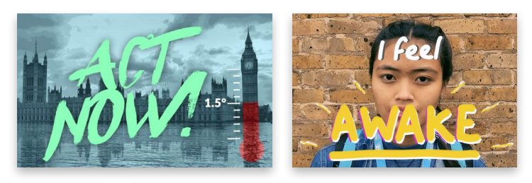
Where we want to be more informal, expressive or it works for our audience (on placards or clothing, for example) we can use handwritten lettering sparingly to highlight actions or quotes.
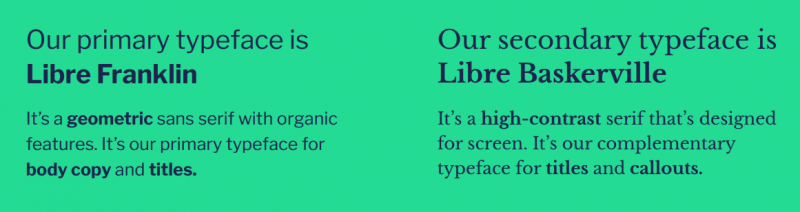
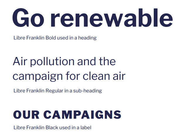
Our primary typeface is Libre Franklin
It’s a geometric sans serif with organic features. It’s our primary typeface for body copy and titles.
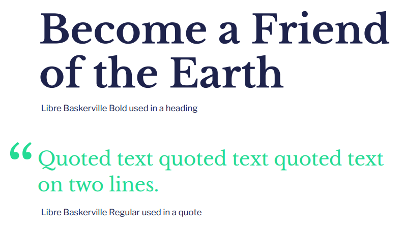
Our secondary typeface is Libre Baskerville
It’s a high-contrast serif that’s designed for screen. It’s our complementary typeface for titles and callouts.
Our approach to imagery reflects our core objectives:
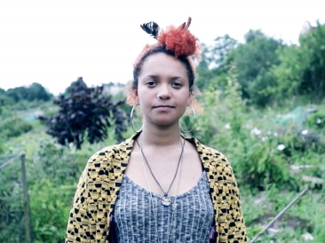
We use portrait photography that focuses on individuals to create a more human, compelling story, representing the diversity of the communities we’re talking to.
We display their name where possible and provide some context of who they are.
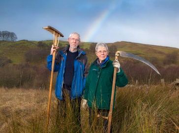
We use images that authentically represent the people and places we’re portraying and that tell a story.
When we use images of places, we say where it is and provide some context.
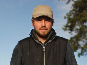
The images we use connect to the story we’re telling – we don’t use generic images of people if we’re not telling their story.
We avoid stock imagery where possible.